User Engagement and Pain Points with Job Board Pages
January 2019 - May 2019 | MyWorldAbroad | Michigan, USA & Toronto, Canada
Team: Three Other UX Researchers and MyWorldAbroad Founder (client) | My Role: UX Researcher
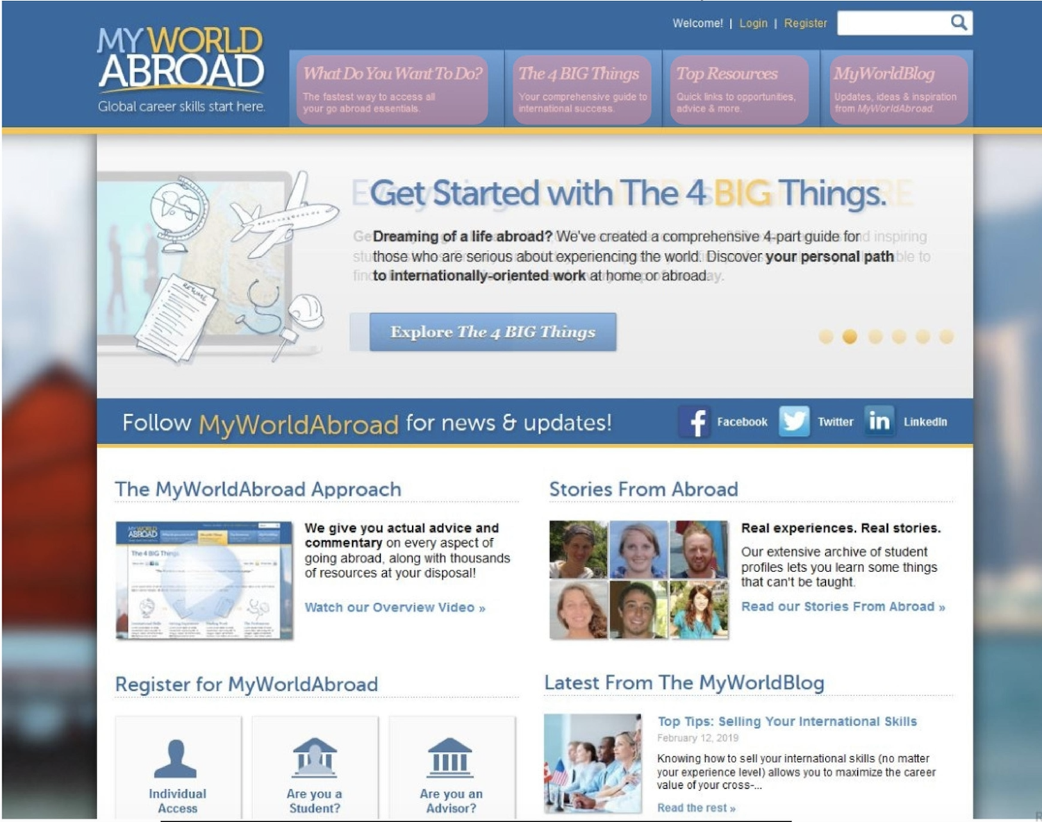
Project Details: MyWorldAbroad is a membership-based informational website catering primarily to North American university students and young professionals pursuing careers abroad. MyWorldAbroad houses over 300 articles containing guidance, advice, and sample documents along with about 4,000 resources including job boards, internship programs, and organizational listings. MWA had been experiencing attrition in paid-subscriptions from university partners.
Project Brief: Our task was to assess the needs of MyWorldAbroad’s primary users (e.g., career counselors, study abroad advisors) and secondary users (e.g., university students) and evaluate the discoverability and pain points of the website’s most frequented user flows.
Hypothesis: Reducing the abundance of content and inconsistent language on the homepage will encourage current users to renew their subscriptions because it facilitates users navigating to the site’s popular resources.
Process
Held stakeholder interview with founder
Carried our research methods (see “project deliverables”) in two and a half week sprints
Socialized research on client’s repository every 2-3 weeks
Recommended priority areas for client to focus efforts after all studies were completed
Some Challenges
Survey response rate: Low response rate on survey could have resulted in a less representative sample of MWA user base
Lack of additional product team members: Main stakeholder was only founder and did not include other product team members which excluded additional voices
Project Deliverables
Generative
[ ] Interaction map: to map out the hierarchy of pages header’s main four flows.
[ ] User interviews: to learn how primary uses engage with MyWoldAbroad and their pain points.
[ ] Personas: to align the team and founder on typical characteristics of the primary users’ (e.g., motivations, job titles).
[ ] Comparative evaluation: to compare MWA to different type of competitors along certain dimensions to identify priority areas (e.g., filtering and search, breadth and depth of resources, look and feel).
[ ] Survey: to learn about the secondary user’ characteristics, attitudes, and behaviors.
Evaluative
[ ] Heuristic evaluation: to systematically uncover the hurdles likely encountered by users as they interact with one main flow
[ ] Moderated usability testing: to evaluate the discoverability of top three user flows (i.e., visual guides, job searches, and testimonials)
💡 Interesting Learnings
Job boards were both primary and secondary users’ most utilized resource. Both sets of users found job boards pages to be unintuitive because most users expected to find updated job positions but instead were met with a listing of organizations and companies.
Most users did not know what content to expect to find in each flow the landing page’s main navigation bar because there was not a feature allowing for discovery (e.g., dropdown menus), the copy lacked consistent language (e.g., interrogative vs declarative language) and information architecture lacked pattern and intuitiveness. This resulted in most of the users using the search feature to identify key resources, such as Visual Guides.